Client
Xtreme Fitness / Xtreme Flex
Client Case Study
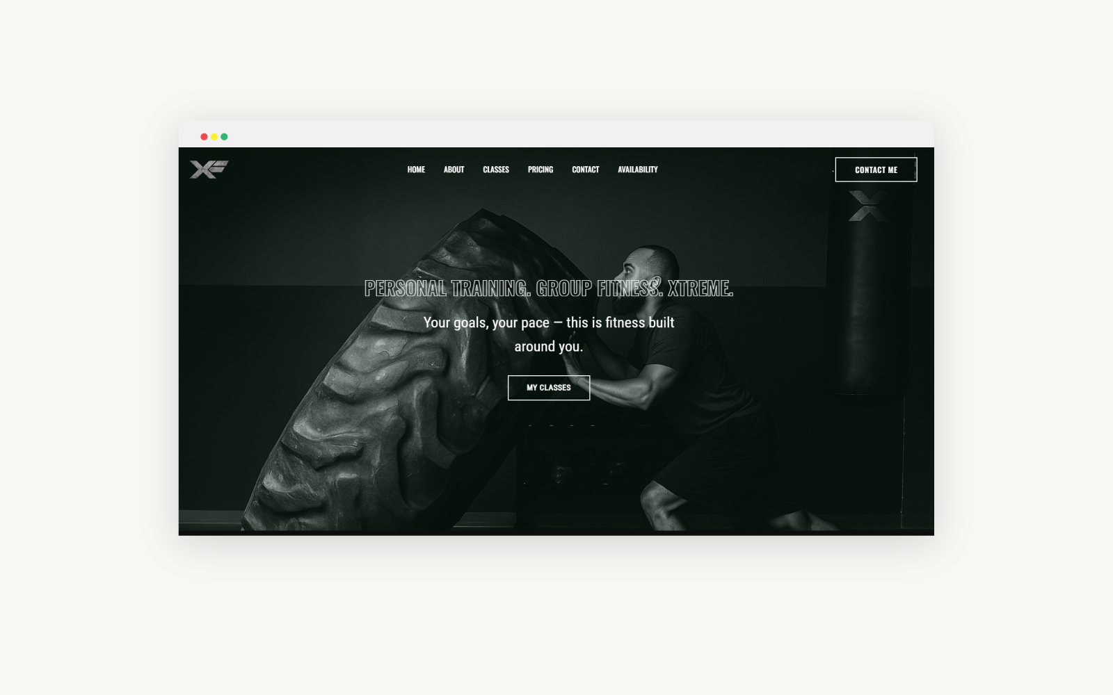
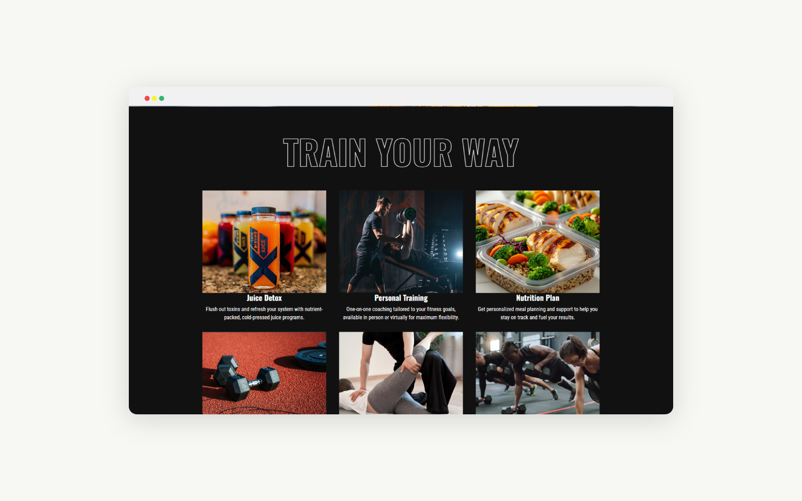
High-energy fitness website for a personal training studio, designed to turn interest into sign-ups. The site focuses on clear programs, easy client intake, and a simple path from “curious” to “I’m ready to start.”
The Challenge
Xtreme Fitness needed a site that did more than list workouts. The owner wanted a simple, professional way for new clients to understand the programs, complete required waivers, and feel confident signing up. The previous experience was split across conversations, paper forms, and older layouts that didn’t reflect the energy of the brand.
The Approach
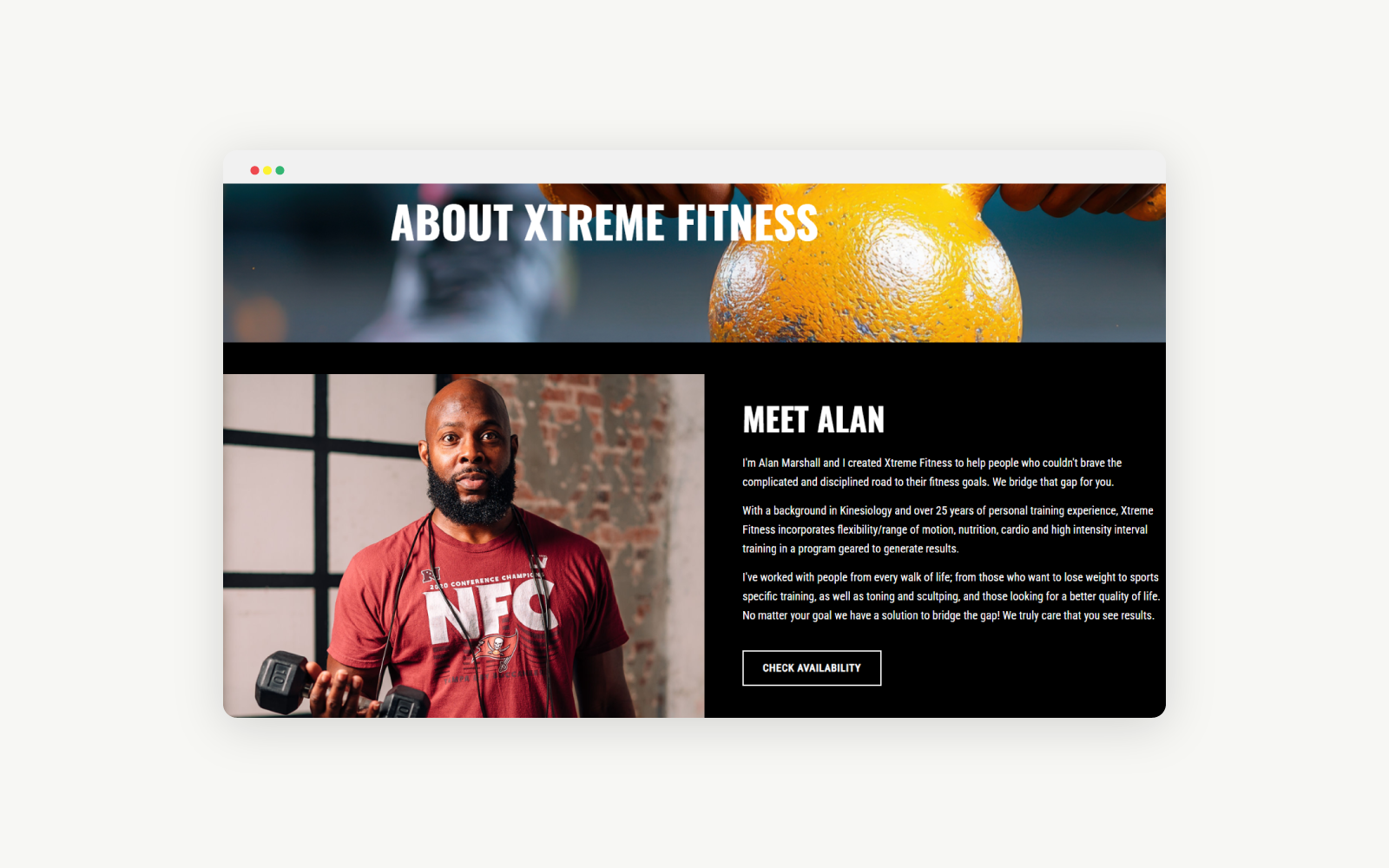
We started by mapping out what actually happens when someone says, “I think I’m ready to train.” From there, the site was planned as a step-by-step journey: learn about the trainer, explore programs, review expectations, and complete the contract/waiver. Every section of the site supports that flow instead of acting like stand-alone pages.
The Solution
Programs and training options are broken into simple sections so visitors can quickly see what’s offered, who it’s for, and how to begin. The layout emphasizes clarity over hype, while still feeling motivating and on-brand.
The site is built to support the full onboarding process: interest, application, contract, and waiver. The content prepares clients for what they’ll sign and why it matters, so the actual form completion feels smoother and less intimidating.
Many clients first visit from their phone, often after seeing social media content or being referred by a friend. The design uses stacked sections, strong headings, and tap-friendly CTAs so the experience feels just as strong on mobile as it does on desktop.
Screens & Layouts

The Impact