Client
M Square Designz
Studio Case Study
Brand identity and website refresh for my own boutique studio; updating the logo, color system, and homepage experience to feel more feminine, elevated, and aligned with the custom, non-template work I deliver for clients.
The Challenge
My original website was built quickly, just to have something live. As my services grew into custom dashboards, wedding funnels, and brand packages, the site stopped reflecting the level of strategy and detail I bring to client work. The visuals felt generic, the structure wasn’t supporting my offers, and the brand didn’t fully express the feminine, boutique energy I wanted clients to experience.
The Approach
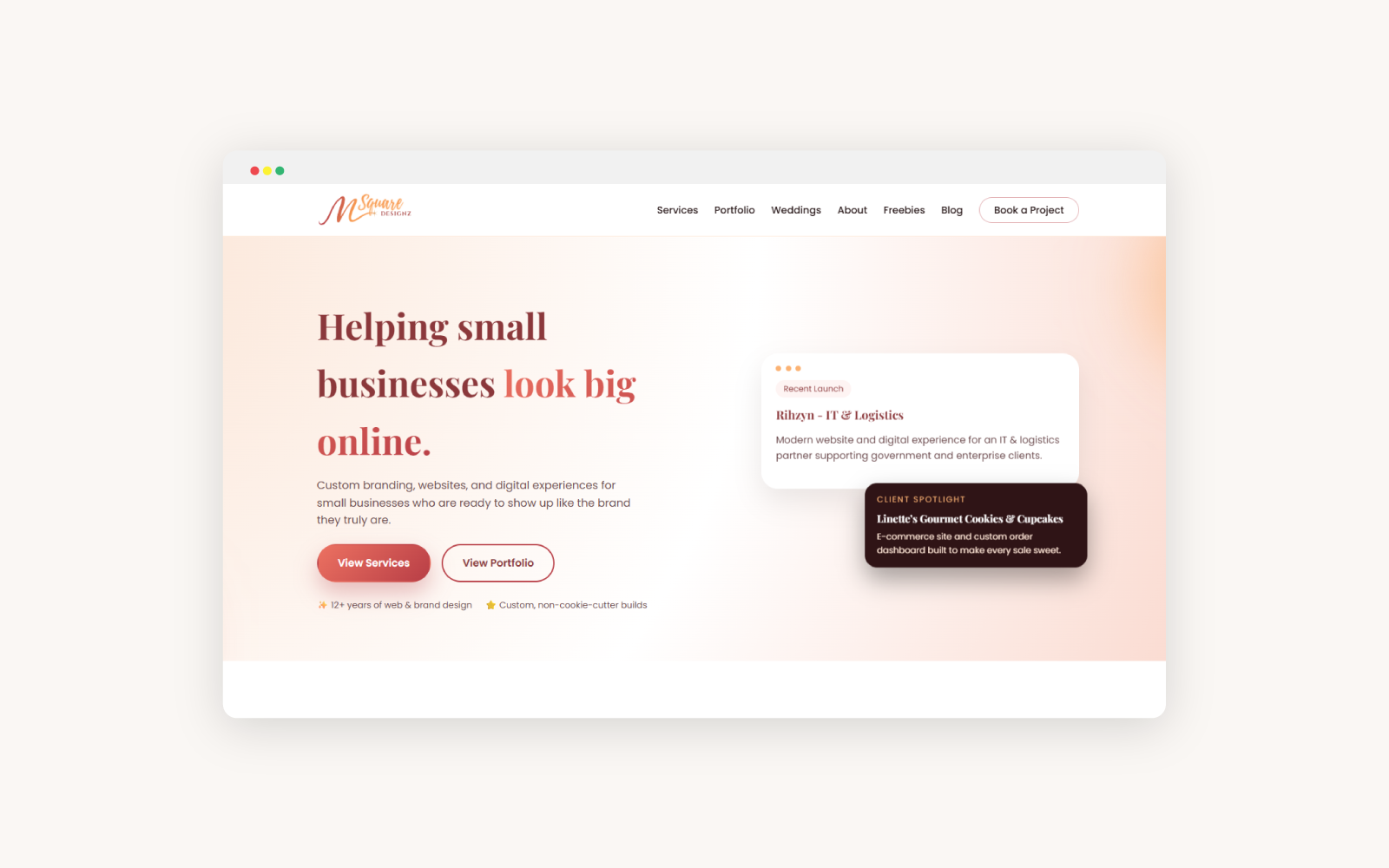
Instead of jumping straight into layouts, I treated this like any other client project. I clarified my positioning, refined my tagline “Helping small businesses look big online,” and built a brand system that could scale across my website, print pieces, and social content. From there, I redesigned the homepage to highlight my core services, portfolio, and process in a way that feels intentional and high-end.
The Solution
The refreshed identity keeps the original abstract mark but updates the type system and colors to feel more polished and studio-level. The gradients, sparkle details, and supporting palette are all tuned for web, print, and digital assets.
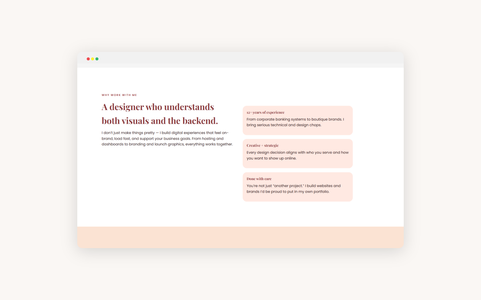
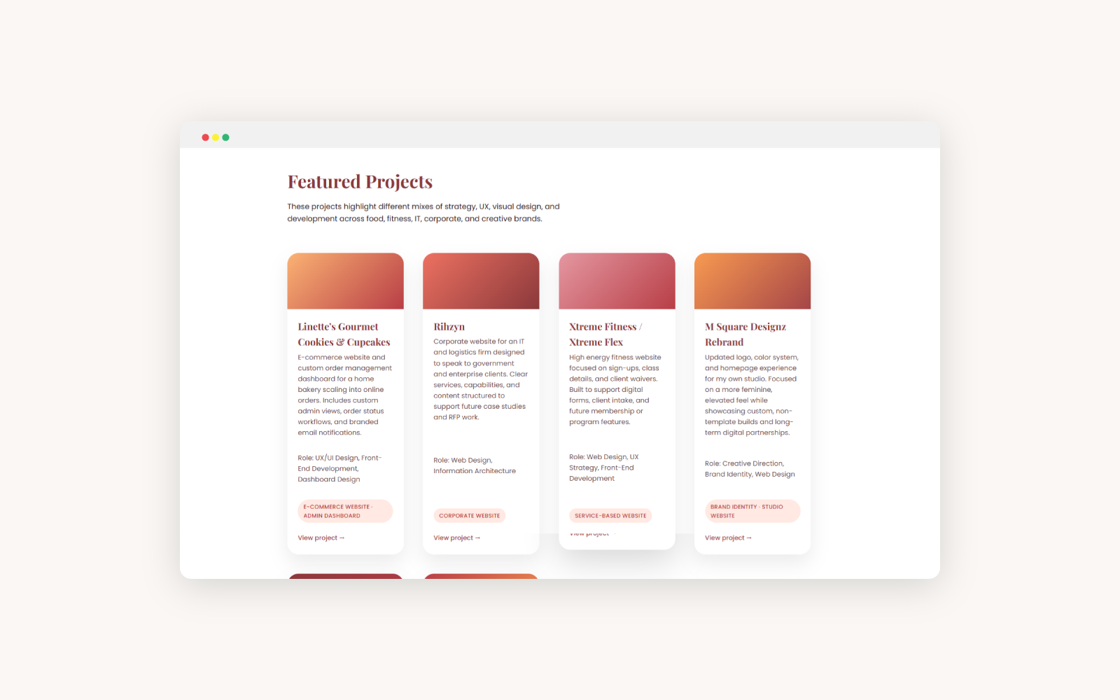
The new homepage is designed like a guided walkthrough: who I help, what I offer, and featured work, all supported by clear calls-to-action. It gives potential clients a quick but complete view of how I can support their brand and website.
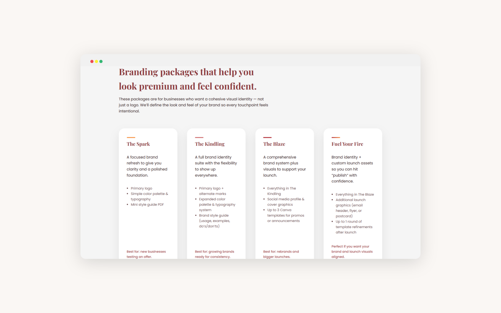
Rather than designing in isolation, I built a set of reusable layout patterns that carry through services, portfolio, and blog pages. This makes it easier to stay consistent as I add new case studies and offers over time.
Screens & Layouts
The Impact