Client
The Business Hub
Client Case Study
Brand refresh and logo redesign for a business support studio helping entrepreneurs streamline their operations. The new wordmark, icon system, and color palette create a modern, professional presence that works across digital, print, and social media.
The Challenge
The Business Hub already had a logo in use, but it felt dated, was difficult to scale, and didn’t fully match the level of professionalism they provide to their clients. Because the project started without a full discovery call, the redesign needed to respect what the owner already liked while quietly solving the technical and visual issues behind the scenes.
The Approach
With limited initial direction, I focused on what the brand needed to communicate: support, clarity, and momentum for small business owners. I used the existing concept as a starting point, refining typography, alignment, and icon shapes so the logo would feel cleaner and more intentional, while also introducing a supporting color and type system to unify future materials.
The Solution
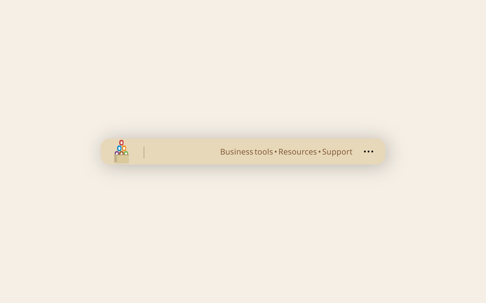
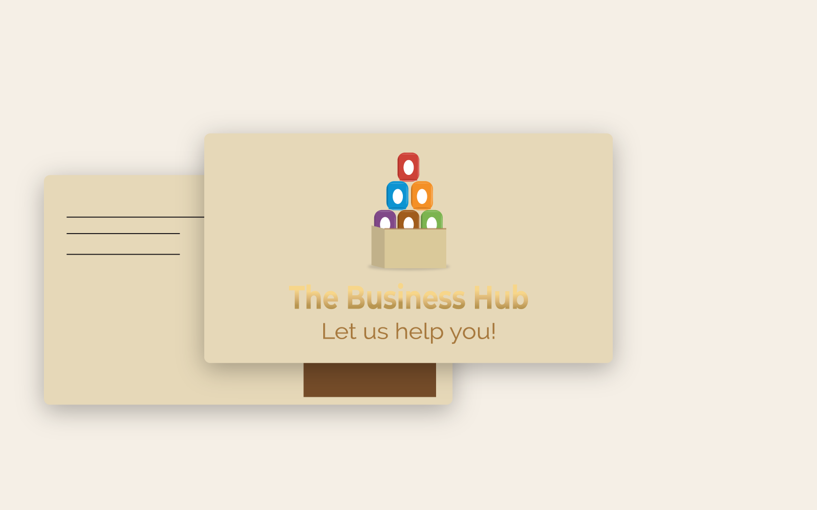
The main logo centers on a clean, confident wordmark for “The Business Hub,” paired with a simple icon that hints at connection and centralization without relying on cliché symbols.
Alternate layouts were created for tight spaces and social channels, so the brand stays recognizable even when there isn’t room for the full lockup.
A streamlined guideline outlines colors, typography, and basic usage so future designers, printers, and virtual assistants can apply the visuals consistently.
Logo & Applications
The Impact