Client
AC DC LLC
Client Case Study
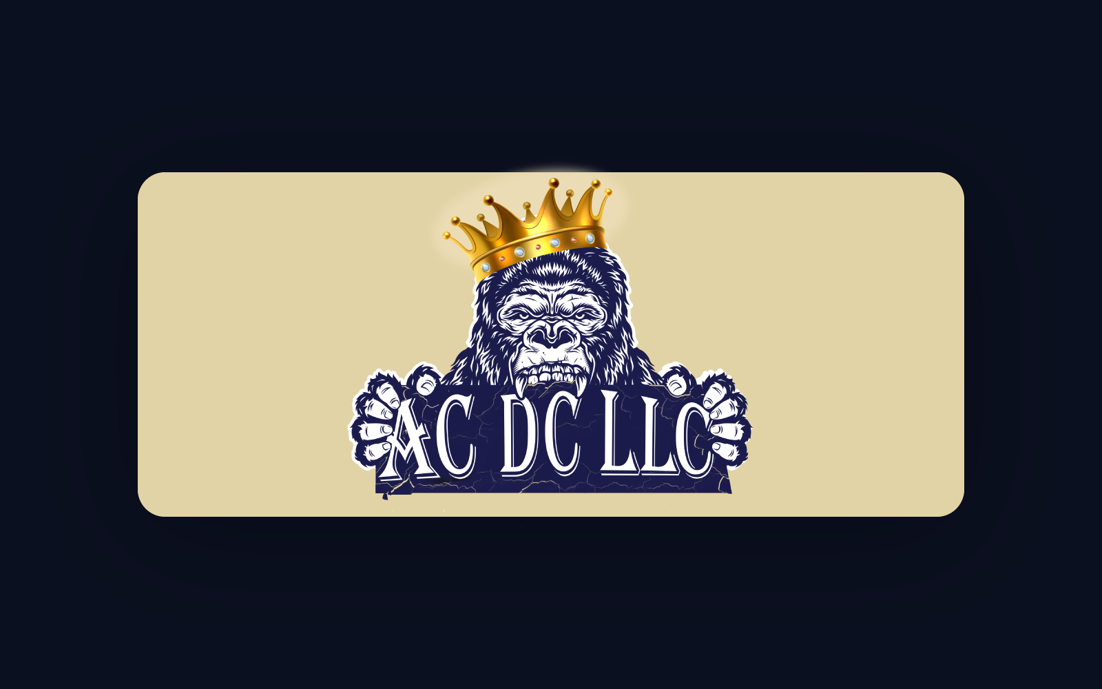
Crest-style logo and brand identity system for a transportation freight and car-hauling company, designed to feel established, reliable, and ready for fleet, uniforms, and marketing.
The Challenge
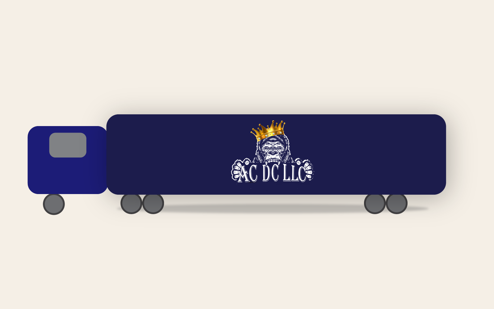
AC DC needed a logo that would look strong on trucks, uniforms, invoices, and signage without feeling generic or clip-art based. The brand needed to communicate reliability, movement, and trust, while still being simple enough to reproduce at small sizes.
The Approach
We started by exploring different crest shapes and monogram layouts using the AC DC initials. From there, we refined the typography, symbol balance, and supporting elements so the logo would hold up both on-screen and in real-world use like trucks, hats, paperwork, and jackets.
The Solution
A bold crest-style mark built around the AC DC initials, designed to look strong on vehicles, signage, and digital platforms.
Alternate logo layouts for compact spaces, social media, and embroidery where the full crest would be too detailed.
A simple set of guidelines so the AC DC team knows exactly how to use the logo, colors, and spacing across future materials.
Logo & Applications
The Impact